I look forward to the day that I have to come up with a logo like David Perdew is doing with his NAMS logo contest. That makes me think of George Lucas and how cool it must be to walk through the store and see Star Wars stuff everywhere. At some point he was sitting on a couch wondering if the idea of Star Wars would ever make it. And now look. . .
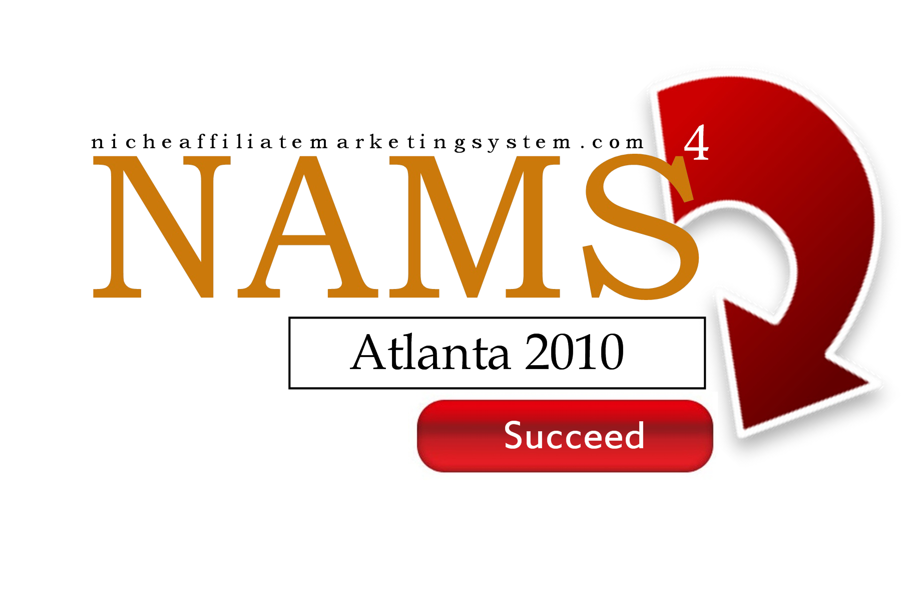
So I jumped on the chance to put together a logo entry for the contest. I visited the official site for the contest and quickly realized that some people are really good at it. So here’s my contest entry and what I was trying to produce:
 I think logos need to be dynamic – not in the Wonder Woman sense, but in the idea that they can change. So I first wanted one that could change with the NAMS idea. What if it become strictly an on-line event at some point? What if it becomes a cruise event? Maybe even just a series of teleseminars? Or even all of the above?
I wanted a NAMS logo that could change with the wind.
Then I wanted one that represented online marketing. I toyed with the idea of the hub-and-spoke structure, something similar to the icon Twitter Grader uses. Then I flirted with David’s idea of building a site that makes $10/day and then starting on the next one – until you have 50. My thought process led nowhere.
Then finally I tried to come up with something that was common to all of that. And I ended up with the opt-in box. List building, newsletter sign ups and even my NAMS Action Guide come with an opt-in box. But more than that – to succeed you have to opt-in to the learning, to the time, to the commitment to the effort. No one is going to do it for you.
Success can not come to you, unless you first opt-in to the idea of it. So the idea is an opt-in box. There’s a spot for your name, and then a button to subscribe. In the case of the NAMS logo, there’s a spot for the event – and a button for succeed.
Simple really.
What I think would be cool is an animated logo on the site where different words fill in that area – which you could click to learn more about it.
Anyway, logos are cool. I look forward to the day my life needs a logo.
Related Posts:
